Hi all !
Conferences and workshops are common events we all take part in, but only few are eventually worth our time.
I would like to share with you the insights I gathered in the Product Design Workshop held by Ben Blumenfeld - Product design manager for facebook.
Along the insights I added questions you should be asking yourself on order to apply the insights and improve your product. So without further a dew, let's kick it off:
Day 1 (Brand):
Brand (definition): A person's feeling about a product, service or company.
Brand has a financial value. Google for example has 140B$ for brand name value !!!
Brand drives choice.
What makes a great brand? a meaningful promise to consumers/users, and time & time again deliver on that promise. (Apple is percepted as innovative company and time over time it delivers on this promise - Mac, iPod, iPhone, iPad, Siri).
Questions for you:
What is your meaningful promise/mission?
- facebook promises to help people share and connect with the people in their lives.
- Google promises to organize the world's information.
How could you deliver on that promise?
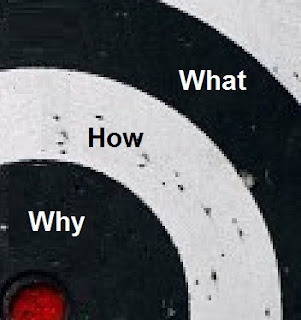
People buy because of
why you do it, and not how or what. Dell had music players before the iPod, HP had tablets before the iPad...
Questions for you:
What do you believe?
- We believe people should have equal access to information.
- we believe in thinking differently.
Day2 (Visual design):
The visual design building blocks are the following:
Color
Fast food chains like KFC are using bright primarily colors since they must overcome the "noise" in the street and stand out.
Inside the fast food chains one will also find strong colors that make you uncomfortable which is intended to get you out right after you are done eating and maximizing turnover.
Sturbucks on the other hand has very pleasant colors indoors to make you feel comfortable like at home and stay and drink as many coffee cups you want.
Pinterest - yellow bar with red button - obvious call to action.
Airbnb - has too many calls to action (List you space, search and see infographics).
Shape
Financial brands are square - indicate stability
Some insights from facebook - they use rounded corners since it gives a more comfortable feeling but it comes over speed since these rounded corners load slower ( a trade off that needed to done).
Scale
The eye goes to largest thing first and so on.
See how the eye goes first to the right image of the phone, than to the left upper part - logo and application name and finishes at the button - the call to action.
Value/Contrast
In order to create hierarchy in the product use contrast, pay attention not to make things look like they are disabled...
Here we see how the gray level creates a hierarchy between the focused tab, tabs with further menus under them and finally leaf categories.
Typography
Great way to create a tone or a mood.
Composition
Like when taking a photo, use the thirds method - put important objects on the intersection of the thirds line.
You can also use imaginary diagonals to emphasis a point.
Grid
Keep things ordered when you use a grid in your product layout.
Pay attention that when using a grid, the eye might join separate sections together just since they are in the same row or column.
All these concepts end up to one thing, what I want to communicate to my users.
Day3 (Interaction Design):
Simplicity
Be data informed, not driven
Know what you're optimizing
Awesome payoffs
- Donate money and we will post your photo on our website.
- Casino are great at this. Slot machines are optimized to generate a visual impact and sound you are seeking when you win, whereas
when you lose it's desert silent.
No dead ends
- if I look Metalllica (3 times the letter l instead of 2) on the iTunes client you will get no results, but if I run this
on the iTunes web site I will get "Did you mean Metallica?"
- If I ask a question on Quora and no one answers, instead of leaving this thread orphaned, they offered you the
option to engage and ask someone specific to answer it - wouldn't you answer it if asked personally?
- Facebook's message: John Smith has accepted your friend request. Write on his wall.
So here you are not just informed but get an option to continue acting in the connection.
In product marketing
- Facebook ads "Create an Ad". User sees a cool ad and thinks "ohh cool why shouldn't I create an ad?!"
Social design
-
Pinterest - see people, content, conversations.
-
Dailymile - One of your friends didn't work out in a year. Send a personal message saying "I miss your activity
posts"
-
Hulu is a bad example, they have the social data but it's placed at the bottom of the page and user needs to
scroll to see it. I am more likely to watch something that my friends are watching or commentating on so why not
use it ?
All these concepts for interaction design are meant to
satisfy the needs & desires of people using the product.
I am sure you are familiar with most of the points I describe above, but if it only made you rethink your product and freshen your memory on these aspects by the real world examples - I got what I wanted, thanks for reading!


